We’ve all been there—you click on a link and end up on a website’s 404 page. A flood of emotions hits you—confusion, sadness, anger, disappointment, and hunger. (OK, maybe that’s just me.)
Regardless, landing on an error page isn’t usually a great experience. It means something has gone wrong. Your expectations haven’t been met. But it doesn’t have to be that way.
When done effectively, your website’s 404 error page can be an opportunity to redirect people and maybe even make them smile. Here are a few simple suggestions for how you can make the most of an error page with some great examples from across the web.
1. Send them back to the homepage
Your website’s home page should be the best starting point for any user. It’s comfortable and safe. You’ve hopefully spent the most time organizing it so that people can find what they’re looking for.
Therefore, redirecting people back to the homepage from a 404 error is a good place to start. Be sure that it’s included in a clear CTA button so that it’s obvious what they should do next.
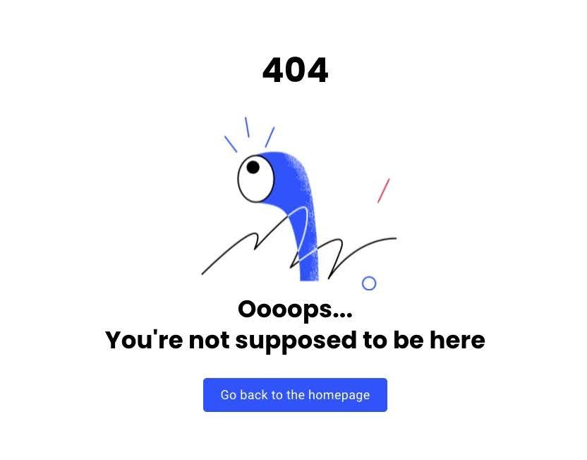
This 404 error page from the social media company Buffer is a good example of how to gracefully guide people back to your homepage.
2. Give them a search bar
Maybe the user is looking for something specific. They typed in something wrong, but are still looking for a particular page.
In this case, providing them with a search bar might be the best option for helping them to navigate the site properly. This is especially helpful if you have a large content library that people comb through, and that occasionally has broken links.
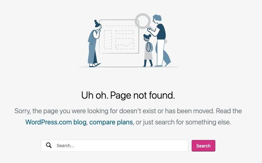
WordPress.com gives us a good example of a 404 error page with a search bar.
3. Provide a few good options
Maybe your home page or a search bar isn’t the right thing to send your user to. Perhaps you have a few other resources in mind that they could benefit from.
This could be a blog, your contact form, or a status report that shows what’s happening with your site. Give people a few options to choose from—but not too many, or they’ll feel overwhelmed.

Hubspot’s 404 error page directs people to their CRM tool, their blog, and their training academy. They’ve picked out three good options for people to pick from.
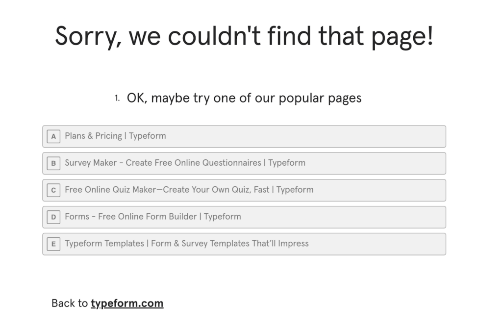
Survey tool Typeform gives people a few more options to choose from but in the form of one of their surveys.
4. Use your branding
Don’t forget that the 404 error on your page is still a part of your website. It’s not a part you want people visiting often, but it’s still a chance to show off your brand.
The worst thing you can do is ignore this page and throw some default branding on it. This makes the unpleasant experience of landing on the error feel even more deflating.
LEGO’s error page puts their iconic mini figures on display and even has a reference to the successful LEGO Movie. Plus, they’ve strategically sent the call to action to send people to shop for their products.
5. Add some animation
Using a static image or branding is a good place to begin. Incorporating some animations into the error page design takes it to a different level. This requires more work but transforms the error experience from bad to marginally enjoyable.
As an animation studio, it makes sense that Pixar would use some moving images on their error page. This gives them a chance to show off a character, make a joke, and incorporate a search bar.
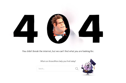
6. Add some humor
404 errors are not inherently funny. They’re a mistake that can leave people frustrated. But you can change that into a more pleasant experience by infusing a little levity.
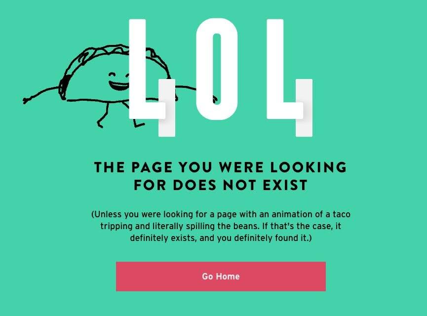
That’s exactly what Taco Bell has done on their error page, which features a walking taco who trips and (literally) spills his beans. They’ve used a simple redirect back to the home page, but landing on the page feels like a little hidden treasure within their website.
7. Visit other error pages for inspiration
We’ve provided you with a few good examples of good error pages from around the web. But you can keep searching for more inspiration yourself. Every website should have a 404 error page, even if they’re not fully leveraging it.
Want to visit it on any page? Simply go to their URL and type in just a little bit of gibberish after the slash. Usually typing in /404 is enough to do the trick. For example, here’s a link to GreenMellen’s 404 page: https://www.greenmellenmedia.com/404. And as you can see, we follow the practice of including a few helpful links to get website visitors back on track.
8. Limit 404 errors
Your goal is to optimize your 404 error page so that it’s a decent experience instead of a crummy one. Even if you take the time to do this well, it should be a mostly one-time project that you can fix and ignore.
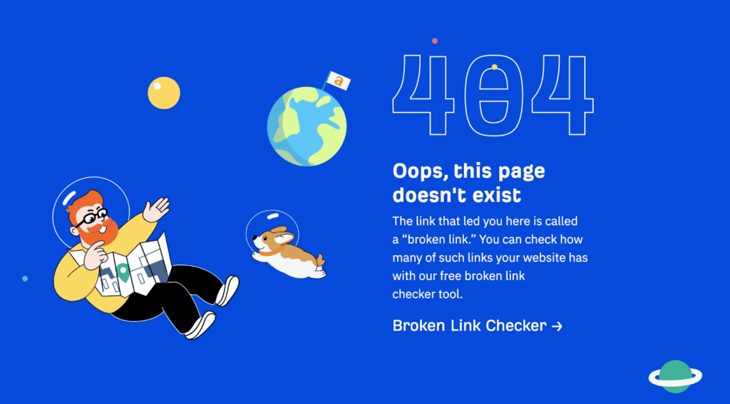
However, you’ll want to still ensure that too many people aren’t accidentally landing on these error pages. Coming to a funny error page once or twice is cute—doing so every time you visit a website is problematic. Use a broken link checker tool like this one from Ahrefs to see where there are potential pitfalls on your site. Fix those links and check them periodically to maintain a good user experience. Ahref’s 404 error page links back to this broken link checker for a very meta 404 page.
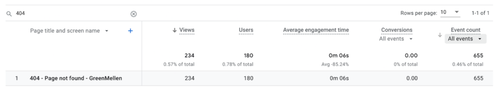
You can also search for the 404 page within Google Analytics to see how many people are landing on an error page. This is a good way to monitor this and make sure it doesn’t get out of hand.
To find this report in Google Analytics 4:
- Click on the Reports tab
- Under Life Cycle, click on Engagement
- Click on the Pages and Screens report
- Search for “404” in the search bar beneath the charts
- This will generate a report for your “Page not found”
Need help with technical errors on your website?
Updating your 404 error page and making sure that links aren’t broken can be easier said than done. This is a vital process for your website user experience, but it might require the help of an expert—like the team at GreenMellen.
Whether you need help developing a new website or maintaining your existing one, we’ve got you covered. Just reach out to us to let us know how we can help.