It’s no secret: businesses with a strong website are the winners in today’s digital landscape.
Now more than ever, people will flock to their screens to check out your business before stepping foot in your store or calling you. Oftentimes, their search starts on your website.
2021 is only weeks away, but there are a handful of things to add/edit to your website to make sure it’s ready for the new year and beyond.
Accessibility and ADA Compliance
This year, we prioritized learning more about ADA compliance for websites, as this is quickly becoming a must-have. All websites need to be inclusive for people with disabilities, which means all visitors should have the same experience when navigating around your website.
Many websites still include major flaws that could prevent someone with disabilities from using them. Even worse, this lack of consideration could result in a costly lawsuit (you should learn more about the price Domino’s had to pay last year).
Having an ADA-compliant website is more than just a part of a good customer service strategy; it can also increase your conversion rate, boost your SEO, and expand your reach.
Website elements that improve accessibility include:
- Creating strong color contrast between text and backgrounds
- Adding focus indicators, such as a line that shows up underneath word links when using keyboard navigation
- Adding functional alt text to all website images
- Not having links open in a new window without informing the user first
Check out these resources about the W3C Web Accessibility Initiative about how people with disabilities use the web and tweak your website as needed.
Website Load Time and Site Speed
While it’s not a new best practice, ultra-fast load time and site speed are extremely important for your site’s success. If you want your website to convert leads and rank well, quick loading times always need to be top priority.
There are plenty of studies to support claims that more than 50% of visitors expect a website to load within two seconds after clicking a link. If it takes longer than two seconds, potential visitors will most likely leave your site and go somewhere else to find what they need.
There are plenty of ways to tune up your site’s speed and audit where it currently stands. This includes:
- Reducing your image sizes
- Keeping your plugins/website updated
- Avoiding bad plugins
Take whatever steps you need to make sure your site doesn’t get hurt by its load time and site speed.
“Thumb-Friendly” Mobile Navigation
A mobile-responsive site is no longer an option; if your website cannot offer the same experience on all devices, this is a change that needs to be made ASAP.
If your website is mobile responsive, take it to the next level in 2021 and make sure it’s thumb-friendly.
What does “thumb-friendly” mean? We’re glad you asked!
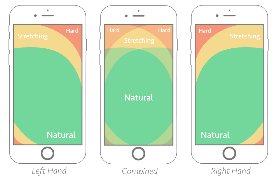
Think about the way you use your phone. If, by chance, you are reading the post on your phone, look at how you’re holding it. Your fingers are probably wrapped around the back of your phone, while your thumb scrolls and clicks. A thumb-friendly website should consider specific zones that are easy-to-reach, hard-to-reach, and a combined “natural” area.
Here is a visual that defines these areas (courtesy of Smashing Magazine):

You can instantly improve your site’s UX by keeping this method in mind for your website.
A Mix of Visual Elements
The best websites allow users to easily digest content, while using visual elements to support your site’s message.
While your website’s copy should never be overlooked, it’s wise to make sure you put as much thought behind the visuals. And it’s also important to give a variety of elements.
From illustrations and graphs to GIFs and videos, there are plenty of ways to add some accompanying elements to your web pages.
Along with the visual elements, make sure your content is also visually appealing and written for the web.
Micro-Interactions
Going along the same lines as the point above, micro-interactions add a nice touch of visual appeal, too. These small animations are used to offer subtle feedback to show users where they can continue their journey on your website.
An example of this would be a link changing colors when a user hovers over it, but it’s time for your website to expand these animations for 2021.
Button hovers and icon hovers are some examples of these, but the sky’s the limit. However, there is a way to overdo these micro-interactions, so keep them tasteful and only add them to areas where it makes sense.
You can check out ARPR, a website we created for a local PR agency, and find all the subtle interactions yourself! Try hovering over the buttons, playing with the interactive infographics, and toggling through the homepage’s Industry sections.
Your website serves as the digital window into your business; leave a lasting impression with your visitors! With these five trends in mind, you can stand out against the competition in 2021 and be seen as the industry leader when it comes to a strong digital presence.
To learn more about 2021 website best practices or to start implementing them on your website, contact GreenMellen today!


