Forty Weeks Well
BRANDING, MESSAGING, PRINT DESIGN

Forty Weeks Well exists to offer new parents life-changing nutritional education and doula services, designed to equip new families for a lifetime of health and wellness.
GreenMellen was tasked with defining Forty Weeks Well's messaging and brand positioning and creating an identity to match.
The modern badge logo we created incorporates an abstract, yet simplified, shape of a stork. We paired this illustration with gender-neutral colors that were both welcoming and soft.
Full Color

One Color


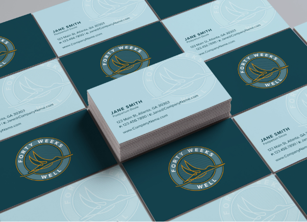
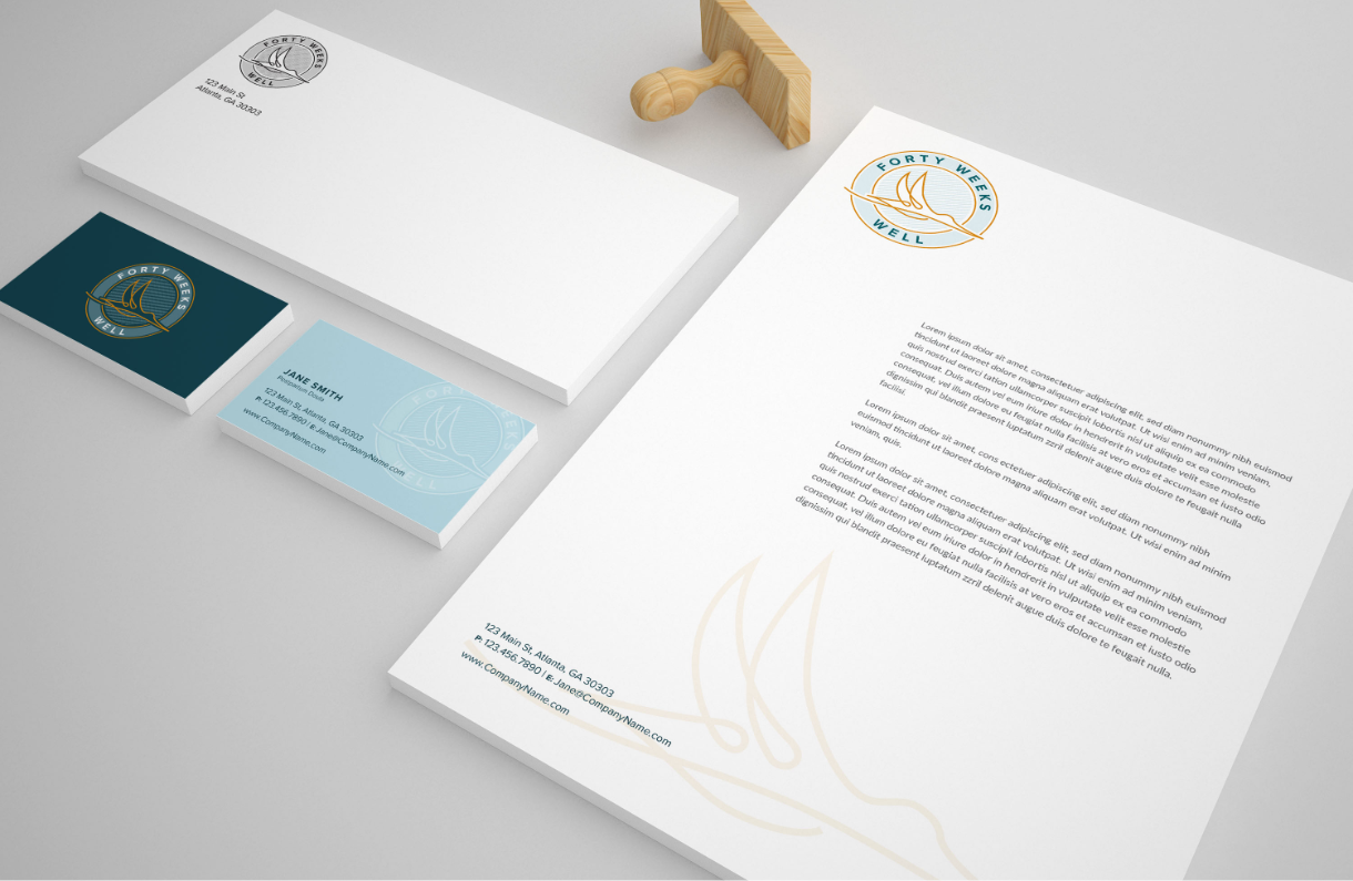
Once the logo was complete, we also created business cards, stationery, and other pieces of marketing collateral.


