There are plenty of proven studies that show why color has an impact on our attitudes and emotions. In fact, research shows that as much as 90% of all product assessments have to do with its color. This is why we wireframe each of our websites before designing them, so we can focus our attention on choosing the right colors after the “skeleton” is finalized.
Color psychology, which is the science of how color affects human behavior, has been long used by brands to convey specific feelings and messages to the market. Because of this knowledge, your website can utilize color psychology to have the same effect on its visitors.
Learn how to effectively use color psychology in your web design to boost conversions, traffic and beyond!
What Feelings Colors Evoke
It’s important to understand that color is interpreted differently for every person. Gender, age, and other societal considerations have a profound impact on how colors are perceived. Sometimes, it’s not always the actual color that brings out feelings; it’s about how a person feels when a specific color is used by a brand. Even personal experiences may skew someone’s opinion about a color, which is entirely out of your control.
All of that being said, there have been plenty of studies conducted to give us some concrete data and trends to keep in mind. Here is a breakdown of how people commonly perceive some colors and how you can take advantage of this for your web design!
Red

The color of fire is often associated with positive feelings such as lust, love, energy and power, but it’s also tied to anger, danger and violence. The industries that should utilize red the most in their web design include fashion, food, emergency services and dating sites.
No matter what industry your business is in, red can be used as an accent color to draw attention to anything specific, but don’t overuse it. Red can create a sense of urgency, so a little goes a far way when it comes to your website. The example above is SiteLock, a company that offers website security tools. As you can see, they’ve used red as an accent to help highlight the sense of urgency people often feel when it comes to website security.
Yellow
This is a color your website needs to tread lightly with, since yellow is known as a color of warning. Even though many brands use yellow to portray their brand as fun and happy, studies show it could put people in a state of exaggerated emotion and response. That being said, “in-your-face” yellow should be used cautiously and accompanied by a darker color.
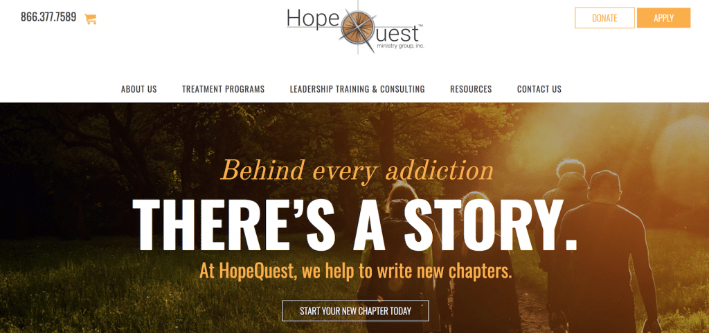
No business wants their visitors to experience a heightened anxiety level when they’re on their website unless it happens sporadically. A yellow call-to-action button may create a sense of urgency that’s needed to guide them to click it. Check out HopeQuest’s website as an example. This rehab facility has a primary CTA button in the header that visitors can click on at any time.
Green
As a verb and adjective, green is one of the most initiative colors. Besides its environmental suggestiveness, studies have proven that green can also improve creativity (and it happens to be a favorite color of ours).
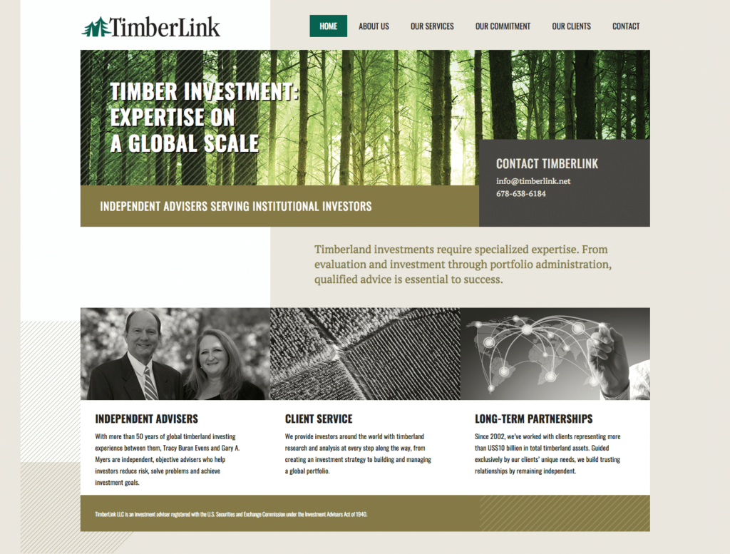
If your business’s website focuses on anything related to nature or the outdoors, green should already be within your color palette. You should also consider using green as a primary color if you work with health products or organic foods, as green promotes well-being. Green has also been linked to growth of power, so financial and banking industries can also use it in their favor. TimberLink, an investment company who provides strategies for building and managing portfolios for those with a particular interest in timber, has a website that’s a prime example of this.

No matter the case, green is a favorite color and lifestyle, and if it makes sense for your brand, use it somewhere on your website.
Blue
Facebook, Twitter and LinkedIn have coined this color to be one of the most dominant colors in the digital world, and it makes sense why.
Depending on the shade of blue, it represents trust, peace, calmness and intelligence, and it probably wasn’t an accident these social media powerhouses picked this color for their branding. If it works with your brand image, blue is a smart choice to use as a primary color for your website.
Even though blue is an all-around good color, it doesn’t do well in food industries (not beverages, just food). A standard tip given to dieters is to use blue plates to curb their appetite, which would have a counter effect on food-related businesses.
White
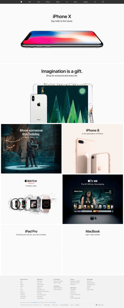
Clean. Modern. Simple. These are three common words associated with white. There’s one website/brand that’s paved the way for this, and you can take a lucky guess as to who that is….

Since the psychological effects of white are often controlled by the other colors in the design, it can be used for any website. This means that you can embrace white space and utilize it to break up your colors and website sections. Use this tip with caution, as an abundance of white can make your site look like it was lazily executed and lack your brand’s personality.
Since white is already associated with the healthcare industry, this color is an excellent choice for the foreground of your website. If you pair white with gold, black or grey, it can give an expensive look, which is perfect for luxury goods.
The Internet has become a very colorful place, and using color psychology in favor of your audience and industry will do wonders for your web design.
If you have questions about color psychology for web design, contact GreenMellen today!


