The Internet brings us a world of knowledge at our fingertips, and this is no exception to tools to help better understand visitor interaction with your website. One of our favorite tools to analyze user behavior is heat maps, which tracks visitors’ mouse and click activity.
Here is a list of some of the remarkable insights you’ll gain when utilizing heat maps for your website:
See What Draws Visitor Attention First
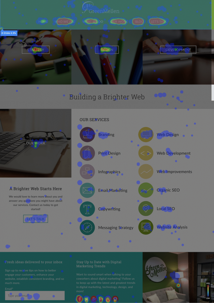
Although traditional heat maps are not capable of eye tracking, they do track mouse movement and clicks. This information alone should provide you with data on what draws your visitors’ attention and intent, as well as what doesn’t. Here are some examples of this using our own website’s heat maps:

As you can see, the red areas get the highest amount of clicks, hovers, and movement, whereas the blue regions get less.

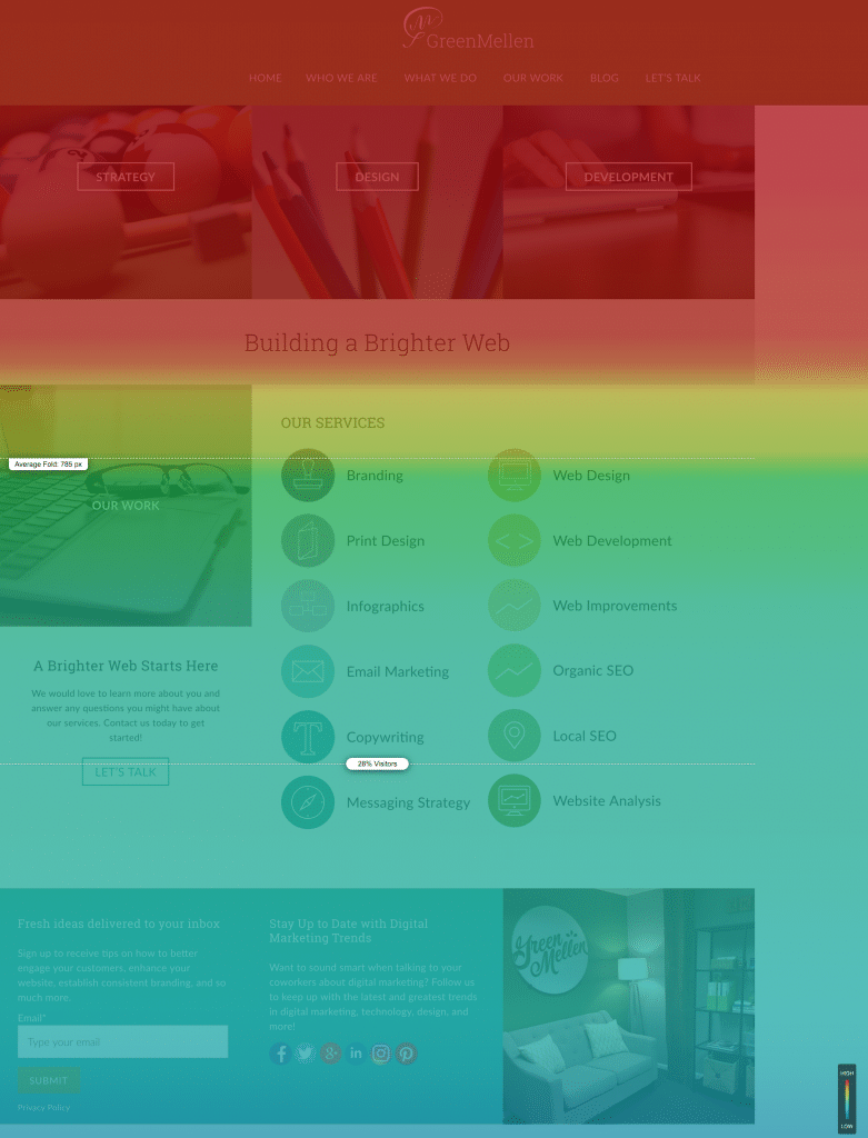
In this shot, this scroll heat map shows what percentage of your visitors are seeing each section of the web page.
With this kind of information, you can reorganize your site to meet the needs of your audience.
Understand What Elements Don’t Matter
On the other hand, heat maps can provide a clearer picture of what elements or sections on your site don’t engage them as they should. With this information, you can either omit what doesn’t work, edit it and test it (more about that later), or rearrange the sections according to engagement. No matter what you decide, heat maps reveal the good and ugly truth about your site.
Make Sure Your Navigation is Clear
If your site has a high bounce rate, which is the percentage of visitors who didn’t visit more than one page, one of the main reasons why this happens can be blamed on your site’s navigation. Visitors may not know how to explore the rest of it once they’ve landed on a page, so they click the back button on their browser. By using heat maps, you can ensure the user experience isn’t disrupted by your navigation and even rearrange the order of your pages to make the most viewed ones more accessible.
Mobile Interaction
Your website’s user experience on mobile devices is more critical than ever, and heat maps can give you a unique glimpse into how your site is performing on these small screens. You can discover very notable trends, ranging from how effortless is it to get to your primary call-to-action to how far are visitors willing to scroll down your website. With insight like that, it’s important to let the power of heat maps give your site a competitive edge on mobile devices!
A/B Test New Options
Some heat map software (we use Freshmarketer) allows you to A/B test different text, elements, colors, and more and show you which one is more effective. For example, say you want to see if red or yellow is a more eye-catching CTA button color. You can create two separate buttons, and the software will automatically split test your visitors to see which one gets more engagement. A/B testing is one of the best research tactics digital marketing allows for, so utilize this as much as possible for your site.
As you can see, there are lots of reasons to love heat maps for websites. We enjoy showing our clients their website’s performance through heat maps and showing them how simple tweaks to their site can have a significant impact on its success.
If you’d like to learn more about heat maps and how you can start taking advantage of their value, contact the GreenMellen team today!


