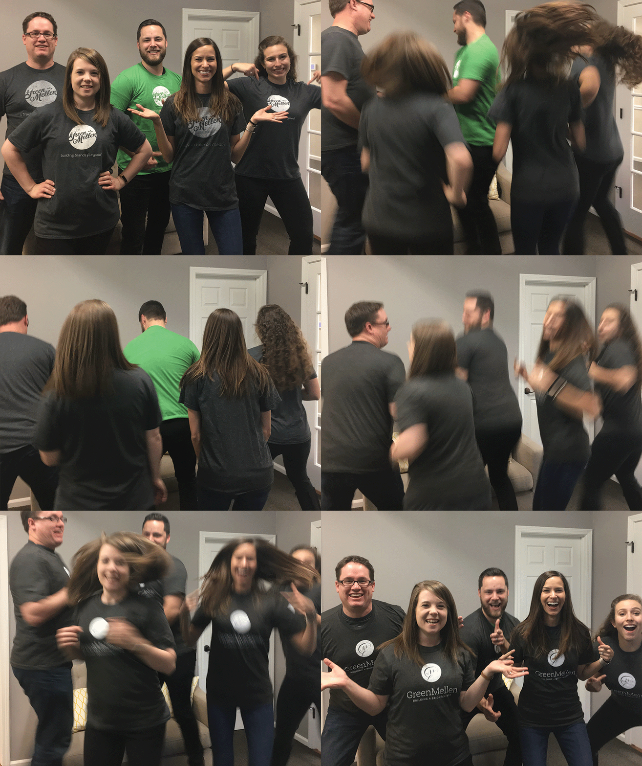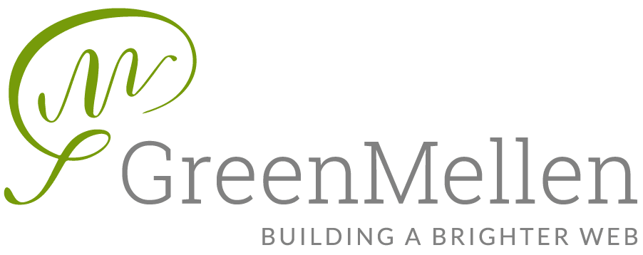
Revising a logo is certainly not an easy task, but we made it a priority to revamp our brand identity this year. After countless doodles and collaboration with our hand-lettering artist and friend Joanna Dee, we’re excited to unveil the new visual identity for GreenMellen:

The logo concept
In our industry, we are always using a balance of our technical and creative minds to create beautiful and functional work for our clients, and we wanted this to be showcased in our new logo…literally. While at first glance this mark looks like a brain, it’s actually made of an abstract “G” and “M” for GreenMellen.
We are excited our visual identity is now strongly focused on our best skill, our “mellens.”
The tagline concept
We also made a slight shift in our tagline. Our previous tagline was “Building Brands for Good,” which explains the balance of our long-term relationship with our clients while always keeping their best interest in mind. Our new tagline, “Building A Brighter Web,” focuses on the services we provide and our belief to always improve.
One of our core values is education. We always strive to provide our clients with the resources they need to understand their website and all the technology they use to market their business. From building websites to producing digital marketing pieces, we aim to make our clients shine brighter, make smarter decisions, and use the best technology available for their needs.
We’re very thrilled about these new branding elements and look forward to having them represent our brand!


